2026
SelfProject

Project Overview
This case study documents the redesign of the mobile recharge flow in the MyJio app for two specific user groups: one-handed users and elderly users. The project was undertaken as part of a Design for Accessibility & Inclusivity course, with the goal of making the recharge experience truly usable for users who are currently underserved by the existing interface.
This case study documents the redesign of the mobile recharge flow in the MyJio app for two specific user groups: one-handed users and elderly users. The project was undertaken as part of a Design for Accessibility & Inclusivity course, with the goal of making the recharge experience truly usable for users who are currently underserved by the existing interface.
"Situational disability affects all of us. A broken arm, a commute, a sleeping baby, these are the same design problem as a permanent motor impairment."
— Inclusive Design principle, Microsoft
"Situational disability affects all of us. A broken arm, a commute, a sleeping baby, these are the same design problem as a permanent motor impairment."
— Inclusive Design principle, Microsoft
"Situational disability affects all of us. A broken arm, a commute, a sleeping baby, these are the same design problem as a permanent motor impairment."
— Inclusive Design principle, Microsoft
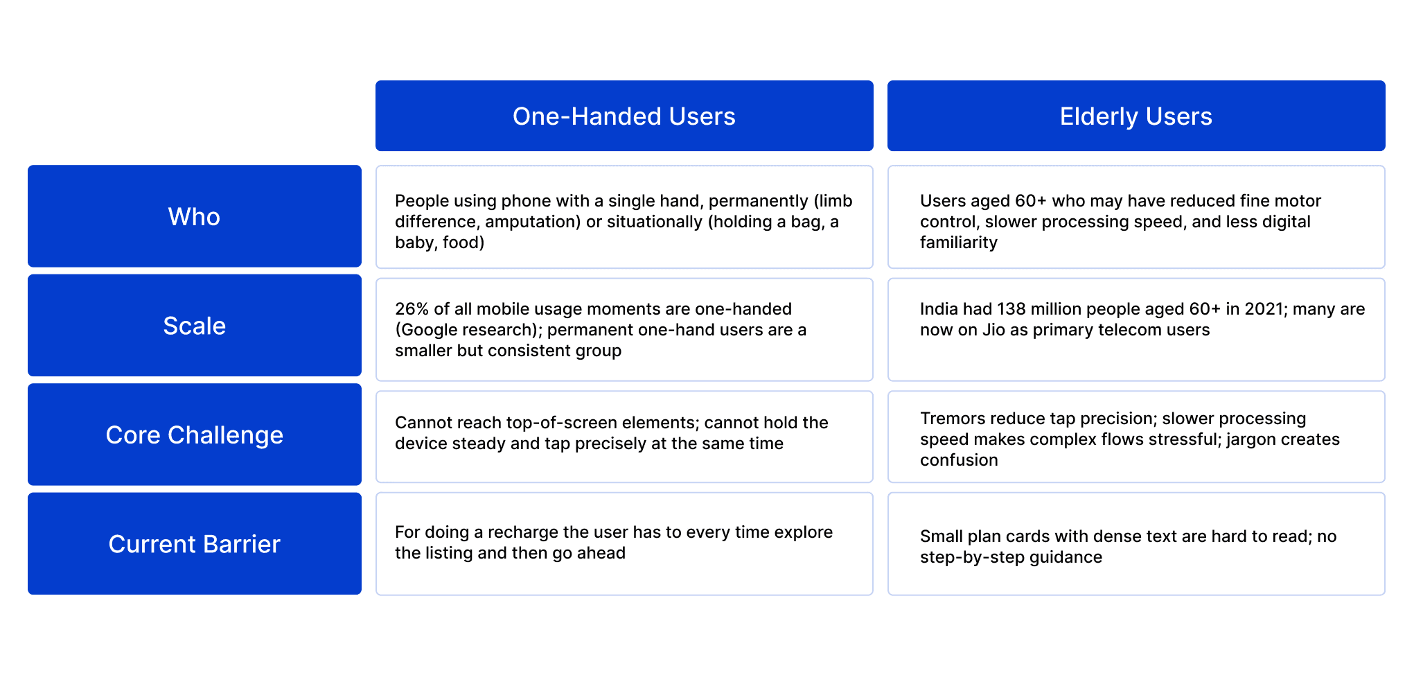
Why These Two User Groups?
The Problem
The MyJio recharge flow was designed for two-handed, digitally fluent users. It places interactive elements across the full screen height, presents multiple simultaneous choices and uses small touch targets making it unreliable for one-handed users who cannot reach across the screen and frustrating for elderly users who struggle with precision tapping and cognitive overload from too many options at once.
"Situational disability affects all of us. A broken arm, a commute, a sleeping baby, these are the same design problem as a permanent motor impairment."
— Inclusive Design principle, Microsoft
"Situational disability affects all of us. A broken arm, a commute, a sleeping baby, these are the same design problem as a permanent motor impairment."
— Inclusive Design principle, Microsoft
Design Goal
Design a guided, assisted recharge experience that:
Design a guided, assisted recharge experience that:

Primary Research
Primary research conducted via surveys, I gathered direct insights from users about their cycling habits, rental preferences, and challenges, which helped identify real needs and validate design decisions.
Primary research conducted via surveys, I gathered direct insights from users about their cycling habits, rental preferences, and challenges, which helped identify real needs and validate design decisions.

Findings from Primary Research
The findings revealed that while cycling isn’t frequent for most, young adults form the primary target audience.
There is strong interest in rentals if the process is simple, affordable, and reliable.
Users emphasized the importance of price, bike condition, and availability, while many owners showed willingness to share their cycles, reinforcing the peer-to-peer model. Additionally, expectations such as flexibility, clear details, reliable support, and useful add-ons highlighted opportunities to create a smoother and more trustworthy experience.
Secondary Research
Before jumping into design, I wanted to understand the bigger picture of peer-to-peer bicycle renting. Since the idea touches multiple stakeholders renters, owners, and even policymakers, I dug into research papers and case studies around bike sharing and collaborative consumption.
A few insights really stood out to me:
Who rents bikes and why:
Studies show that people often rent bikes for short trips under 5 km especially in Indian cities where this is a large share of daily travel.
Renters are usually motivated by health benefits, environmental consciousness, and affordability.
Studies show that people often rent bikes for short trips under 5 km especially in Indian cities where this is a large share of daily travel.
Renters are usually motivated by health benefits, environmental consciousness, and affordability.
Who lists bikes and why they hesitate:
Research on peer-to-peer mobility (cars, bikes, cargo bikes) reveals that people are willing to share if they feel protected against theft or damage
Owners hesitate when the process feels like “too much work,” so the platform needs to make listing a bike as easy and low-risk as possible
Research on peer-to-peer mobility (cars, bikes, cargo bikes) reveals that people are willing to share if they feel protected against theft or damage
Owners hesitate when the process feels like “too much work,” so the platform needs to make listing a bike as easy and low-risk as possible
The trust gap:
Almost every paper emphasized that trust is the bottleneck.
Features like identity verification, security deposits, insurance, and photo check-ins were highlighted as ways to reduce fear for both owners and renters.
Almost every paper emphasized that trust is the bottleneck.
Features like identity verification, security deposits, insurance, and photo check-ins were highlighted as ways to reduce fear for both owners and renters.
Competitor Analysis
Through benchmarking similar apps, I explored how navigation is structured, what best practices the industry follows, and which heuristic principles can enhance usability
Conducted feature based benchmarking for four similar apps:
Through benchmarking similar apps, I explored how navigation is structured, what best practices the industry follows, and which heuristic principles can enhance usability
Conducted feature based benchmarking for four similar apps:


Key Insights
Map View as Dominant Home Feature
Lime and Ola prominently feature a map view
Go Bikes and Royal Brothers focus on planned rentals
Lime and Ola prominently feature a map view
Go Bikes and Royal Brothers focus on planned rentals
Journey/Destination Search
Ola uniquely places a destination search.
Other apps support either instant rides or planned rentals
Ola uniquely places a destination search.
Other apps support either instant rides or planned rentals
Vehicle Listing and Booking
Go Bikes, Ola, and Royal Brothers emphasize a vehicle list
Go Bikes and Royal Brothers include “Book Now” buttons directly on vehicle cards
Lime focuses on scanning/locating bikes
Go Bikes, Ola, and Royal Brothers emphasize a vehicle list
Go Bikes and Royal Brothers include “Book Now” buttons directly on vehicle cards
Lime focuses on scanning/locating bikes
Personalization and Guidance
Ola and Royal Brothers provide personalization features
All apps include promotional banners, user account shortcuts, and help/support links.
Only Ola and Royal Brothers include “How It Works” or FAQ
Ola and Royal Brothers provide personalization features
All apps include promotional banners, user account shortcuts, and help/support links.
Only Ola and Royal Brothers include “How It Works” or FAQ


User Persona


Customer Journey Mapping
Through customer journey mapping, I analyzed how users interact with the app across different stages, uncovered their pain points and emotions, and identified opportunities to create a smoother, more engaging experienceConducted feature based benchmarking for four similar apps:
Through customer journey mapping, I analyzed how users interact with the app across different stages, uncovered their pain points and emotions, and identified opportunities to create a smoother, more engaging experienceConducted feature based benchmarking for four similar apps:

Information Architecture
Through information architecture, I organized the app’s content and features into a clear hierarchy, defined intuitive navigation paths, and ensured users can easily find what they need without confusion
Through information architecture, I organized the app’s content and features into a clear hierarchy, defined intuitive navigation paths, and ensured users can easily find what they need without confusion

Screens


